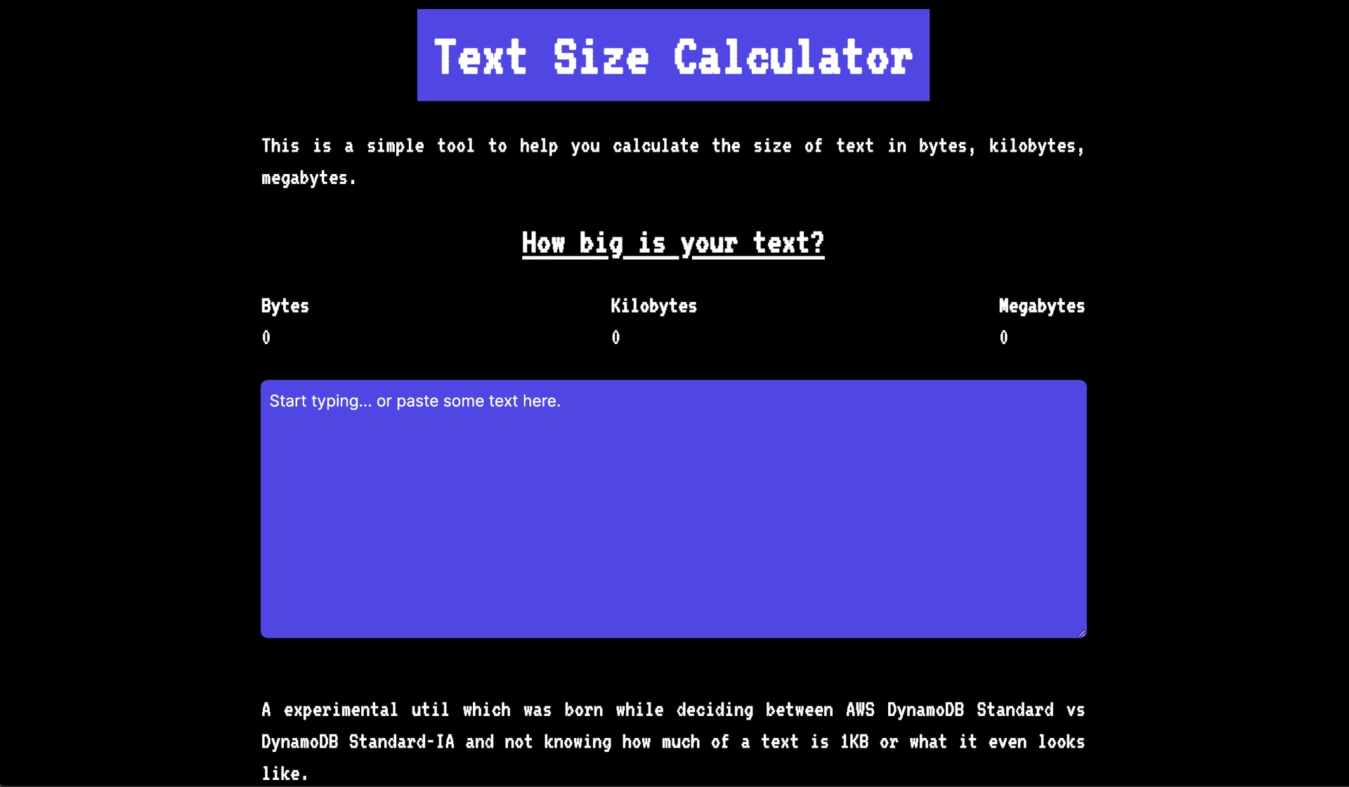
Text size calculator
Created on 5 October, 2024 • Text Tools • 54 views • 4 minutes read
Text Size Calculator: Optimize Your Font for Readability
A text size calculator is an essential tool for web designers, developers, and content creators who want to ensure their text is clear, readable, and user-friendly across various devices. By using the right font size, you can enhance user experience, improve accessibility, and ensure your content is visually appealing.
1. What Is a Text Size Calculator?
Definition of a Text Size Calculator
A text size calculator helps determine the appropriate font size for web content, digital designs, or printed materials based on factors like screen size, resolution, and readability standards. It helps you find the perfect balance between aesthetics and functionality, ensuring your text is neither too small to read nor too large to fit neatly into the design.
How It Works
A text size calculator typically uses input parameters like the desired viewport width, the type of device (desktop, tablet, mobile), and the base font size. With these inputs, the calculator suggests the optimal font size in various units, including pixels (px), em, rem, and points (pt).
2. Why Use a Text Size Calculator?
Ensures Readability Across Devices
One of the primary reasons to use a text size calculator is to ensure your text remains readable across all devices. Mobile users, in particular, require appropriately scaled fonts to avoid zooming or scrolling excessively to read content. A good text size improves readability and user engagement.
Improves Website Accessibility
Choosing the right text size also improves accessibility for users with visual impairments. Using a calculator helps you select a font size that complies with accessibility guidelines, such as the Web Content Accessibility Guidelines (WCAG), ensuring your website is user-friendly for all audiences.
Enhances Visual Hierarchy
Proper text sizing creates a clear visual hierarchy in your design, making it easy for readers to distinguish headings, subheadings, and body text. A text size calculator ensures that font sizes align perfectly with your design's structure, creating a smooth flow for your content.
3. How to Use a Text Size Calculator Effectively
Step-by-Step Process
- Select Your Base Font Size: The base font size is typically 16px for most websites, but it can vary depending on your design's aesthetic.
- Input the Device Dimensions: Specify the screen size or viewport width where the text will appear. For responsive designs, input different device sizes like desktop, tablet, and mobile.
- Adjust for Readability: Based on user preferences or specific needs, adjust the recommended size to fit your design’s requirements. Make sure the text remains readable even on small screens.
- Preview the Font Size: Many calculators offer a preview of how the text will look across different devices. Use this to ensure consistency in your font scaling.
Choose the Right Units: px, em, or rem?
- Pixels (px): Best for precise font sizing but less flexible for responsive design.
- Ems (em): A scalable unit that allows your text to adjust based on the parent element's font size, making it more responsive.
- Rems (rem): Similar to em but references the root element size, offering a more consistent scaling experience across different elements.
4. Benefits of Using a Text Size Calculator
Enhance User Experience
With the right text size, your content becomes more readable and engaging, keeping users on your site longer. A text size calculator ensures that you find the perfect balance between design and readability, improving overall user satisfaction.
Create Consistent Designs
For designers working on multiple platforms, a text size calculator helps maintain consistency across devices and screen sizes. It ensures that your typography is perfectly scaled, maintaining a professional and polished appearance.
Improve SEO Rankings
Readable and accessible text is a key factor in SEO. Search engines like Google consider user experience and accessibility when ranking websites. By optimizing your font sizes, you not only enhance your site's usability but also potentially boost its SEO performance.
Save Time in the Design Process
Manually adjusting font sizes can be time-consuming, especially when working on responsive websites. A text size calculator streamlines the process, allowing you to quickly determine the best font size for each device without trial and error.
5. Best Practices for Using a Text Size Calculator
Maintain Readability Standards
When using a text size calculator, always prioritize readability. The recommended base size for body text on websites is typically 16px, but you may need to adjust it based on your audience and content type. Make sure headers, subheaders, and body text are appropriately sized to maintain a clear hierarchy.
Test on Multiple Devices
Ensure that your text sizes look good across different devices and resolutions. Test your font sizes on mobile, tablet, and desktop to see how they adapt. A good text size calculator should allow you to simulate different device sizes to get a clear picture of the final result.
Adjust for Different Font Types
Not all fonts are created equal—some are naturally larger or smaller than others at the same size. When using a text size calculator, consider the specific font type you're working with. For example, sans-serif fonts like Arial may appear smaller than serif fonts like Times New Roman at the same pixel size.
Conclusion: Why You Need a Text Size Calculator for Your Web Design
A text size calculator is an indispensable tool for anyone working on digital content, from web designers to developers and content creators. It ensures that your text is readable, accessible, and optimized for various devices, improving user experience and enhancing SEO performance. By incorporating a text size calculator into your design process, you can create visually appealing, user-friendly content that looks great across all platforms.
Popular posts
-
Ascii converterConverter Tools • 116 views
-
Hex converterConverter Tools • 106 views
-
Binary converterConverter Tools • 95 views
-
Case converterText Tools • 92 views
-
DNS LookupChecker Tools • 91 views